So here is the data set -

It's really a simple data set. It shows the different kind of fish caught along the Hudson and the locations of the various places they were caught and how far they are from the mouth of the Hudson.
The first thing I did was to add a little circle to the data set. The bigger the circle, means more fish were caught. Amazing how something as simple as that, immediately brings your attention to the fact that the Atlantic silverside was the most caught fish and it was in Verplanck. Our mind is immediately able to see that the circle next to 180 is bigger than the circle next to 113 (despite these being pretty small circles). If you look at the data set above, it would have taken you some time to be sure that 180 was the largest number. You would have to scan to make sure nothing was bigger. See how much time a visual cue saves?

The teacher had posed 3 questions -
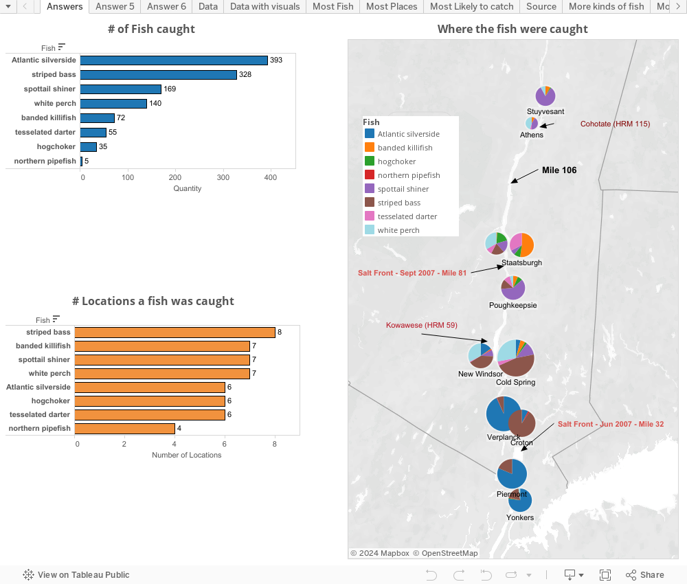
1. Which was the most caught fish?
2. Which fish was caught in the most locations?
3. If I am fishing at mile 106 from source of the Hudson, what are the 4 most common fish I would catch?
So here is the challenge - Answer the 3 questions based on the data above and see how long it takes you.
Note that time down.
Now look at the dashboard I created and see how long it takes to answer the question. Click on a fish and visually see where it was caught.
No comments:
Post a Comment