When it comes to data I seem to find people fall on a spectrum that goes from fear/hatred to indifference to curiosity. It is not surprising that a lot of people are plain indifferent to data. They are much more comfortable making decisions based on intuition and half-hearted analysis.
Then there is a group that has no choice but have to work with data and they are either scared of data (they hide behind the 'I'm not really good with data') or hate their work because it involves data.
The last category are the ones that proudly call themselves as data geeks. They thrive with data.
This post is targeted more towards the first group - the ones that hate / fear data.
How much of that fear / hate is brought about by the technology they use? I had done a post a couple months ago about how, when you give an expert the wrong technologies they become average and when you give the average person the right technology they become an expert. What I've figured out over the last couple months, is that when you give an average person the wrong technology you create fear / hatred.
I was with a customer the other day and they were gushing about the undo button in Tableau. All along, I knew it was cool having an undo button but what struck me was that this customer actually went from fear of working with data to joy because of this one little button. They went from one end of the spectrum to the other.
They talked about how before Tableau, if they made a mistake in building out their dashboard, they had to start from scratch. So over time, the product they used had trained them to be scared and killed all curiosity. They never deviated from the exact same steps every time. There would be times they wanted to experiment a bit but the thought of having to start from scratch, killed that thought.
Now with Tableau, they feel freed. They can experiment with their data, be curious, go down various paths of analysis and if they don't like something they just keep hitting the undo button till they come back to a state they were happy with.
Who knew that the little undo button could move someone from fear to curiosity..
Saturday, December 14, 2013

Saturday, November 9, 2013
Tableau Dashboards on iPad - Embedded Javascript to get scrollbars
The iPad (iOS) does not support iFRAMES. So if you have a website where you've embedded a Tableau dashboard in an iFRAME (see my previous post), when you look at it on an iPad, it will be expanded to fit the entire width of the dashboard. Your height / width parameters in the iFRAME will be ignored. If you are ok, with your dashboard being expanded (no scrollbars around the iFRAME) then you are good.
Just to be clear, this has nothing to do with Tableau. This will happen with any iFRAME webpage.
There are cases where you want to keep it to a certain height and width. This post shows how you can do that, but you cannot use an iFRAME. You will have to take the SCRIPT tag that Tableau generates and embed it into the code of your webpage.
What you need to do is after the <SCRIPT> </SCRIPT> tag entry add the following div tag -
<div id="wrapper" style="-webkit-overflow-scrolling: touch; height: 100%; overflow: auto; width: 100%;">
then at the end of all the Tableau generated div, put your closing </div> tag.
This will now allow you to keep your dashboard within a certain height / width and you will get scroll bars on your iPad. Test this viz out to see how it looks on an iPad. I specifically created a really bad dashboard that has multiple scrollbars within the dashboard and really long and wide, so you can see the scrollbars.
btw. the scrollbars inside the dashboard work even when you have an iFRAME.
Just to be clear, this has nothing to do with Tableau. This will happen with any iFRAME webpage.
There are cases where you want to keep it to a certain height and width. This post shows how you can do that, but you cannot use an iFRAME. You will have to take the SCRIPT tag that Tableau generates and embed it into the code of your webpage.
What you need to do is after the <SCRIPT> </SCRIPT> tag entry add the following div tag -
<div id="wrapper" style="-webkit-overflow-scrolling: touch; height: 100%; overflow: auto; width: 100%;">
then at the end of all the Tableau generated div, put your closing </div> tag.
This will now allow you to keep your dashboard within a certain height / width and you will get scroll bars on your iPad. Test this viz out to see how it looks on an iPad. I specifically created a really bad dashboard that has multiple scrollbars within the dashboard and really long and wide, so you can see the scrollbars.
btw. the scrollbars inside the dashboard work even when you have an iFRAME.
Tableau Dashboards on an iPad - Using iFRAMES
The iPad (iOS) does not support iFRAMEs. So if you have a Tableau Viz in an iFRAME on your website and you view it on an iPad, you will see that your height and width are ignored and the dashboard is expanded to take over the entire screen. You can view it on a browser on your computer to see the difference. On your computer, the dashboard is kept within the height and width and you get the vertical and horizontal scrollbars. On an iPad it gets expanded. That being said, any scrollbars within the dashboard are still scrollable on the iPad.
Just to be clear, this has nothing to do with Tableau. This will happen with any iFRAME webpage.
In the example below, I set the height and width of the iFrame to 400 / 400, to exaggerate the effect. This is a really bad dashboard from a view-ability standpoint, but it is useful to get the point across. When you view this on an iPad, it starts out as 400 x 400 but when it finishes rendering it gets blown up to fit the entire visualization.
Just to be clear, this has nothing to do with Tableau. This will happen with any iFRAME webpage.
In the example below, I set the height and width of the iFrame to 400 / 400, to exaggerate the effect. This is a really bad dashboard from a view-ability standpoint, but it is useful to get the point across. When you view this on an iPad, it starts out as 400 x 400 but when it finishes rendering it gets blown up to fit the entire visualization.
Sunday, October 20, 2013
Tableau - The Jetsons Spacecar of BI Tools - Infographic
I had written a blog post some time back about how I considered Tableau to be the Jetsons Spacecar of BI tools. I was never really happy with how verbose it was and how long it took in words to get my point across. Been thinking about "visualizing" it. You know the saying - A picture paints a thousand words and in line with what Tableau stands for - A visual representation of your data leads to faster insights. So here is my attempt to create an infographic. I'll let you decide which is better..

Wednesday, October 16, 2013
Vacation anyone?
I was looking at a graphic that had details on all the top airlines, airports and routes flown to in 2012. It was quite interesting. One of the things that stood out was that Denver airport, was in the top 5 on all 3 categories - Distance flown, Passengers and destinations flown to. Then again, considering that it is centrally located, it does make sense. The New York airports were conspicuous in their absence, but considering that there are 3 airports to choose from, cannibalization explains that anomaly. Another interesting tidbit, if we look at which airlines are flying out of the top airport (by # of unique destinations), SkyWest Airlines stands out. Who knew it would be in the top 5 for each of the 5 airports. Maybe because it is a regional carrier, it covers a lot of local routes. That is something worth looking into though.
So all this looking at flight data (see below for the visual)
 got me thinking about going on vacation.
Which brought on new questions - So what are the top places people are flying to, what airlines fly into those places and which of the airlines are the most punctual.

once I narrowed down to an airline, I was really curious on what the top 3 routes flown by that airline was
 and once I saw this and with things getting cold in NY, I decided to fly to San Juan on Jetblue.. joining me?
it is fun to play around with data (data source transtats.bts.gov)
So all this looking at flight data (see below for the visual)
Which brought on new questions - So what are the top places people are flying to, what airlines fly into those places and which of the airlines are the most punctual.
once I narrowed down to an airline, I was really curious on what the top 3 routes flown by that airline was
it is fun to play around with data (data source transtats.bts.gov)
Wednesday, October 9, 2013
My 5th Grader's homework visualized
I was excited to hear that my 5th grader was going to learn how to use visual models to understand numbers and decimals. Looking at him manually go through a data table and spending minutes on each answer (and longer on some of the tricky ones), I wondered if Tableau and the power of visual analytics held true for a 5th grader.
So here is the data set -

It's really a simple data set. It shows the different kind of fish caught along the Hudson and the locations of the various places they were caught and how far they are from the mouth of the Hudson.
The first thing I did was to add a little circle to the data set. The bigger the circle, means more fish were caught. Amazing how something as simple as that, immediately brings your attention to the fact that the Atlantic silverside was the most caught fish and it was in Verplanck. Our mind is immediately able to see that the circle next to 180 is bigger than the circle next to 113 (despite these being pretty small circles). If you look at the data set above, it would have taken you some time to be sure that 180 was the largest number. You would have to scan to make sure nothing was bigger. See how much time a visual cue saves?

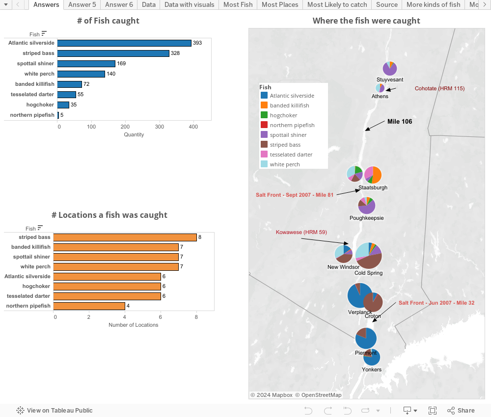 This is the power of visual analytics. This is the power of Tableau. A picture does speak a thousand words and it is so much more fun, easy and well worth the 15 minutes (took longer to write this blog post)
So here is the data set -

It's really a simple data set. It shows the different kind of fish caught along the Hudson and the locations of the various places they were caught and how far they are from the mouth of the Hudson.
The first thing I did was to add a little circle to the data set. The bigger the circle, means more fish were caught. Amazing how something as simple as that, immediately brings your attention to the fact that the Atlantic silverside was the most caught fish and it was in Verplanck. Our mind is immediately able to see that the circle next to 180 is bigger than the circle next to 113 (despite these being pretty small circles). If you look at the data set above, it would have taken you some time to be sure that 180 was the largest number. You would have to scan to make sure nothing was bigger. See how much time a visual cue saves?

The teacher had posed 3 questions -
1. Which was the most caught fish?
2. Which fish was caught in the most locations?
3. If I am fishing at mile 106 from source of the Hudson, what are the 4 most common fish I would catch?
So here is the challenge - Answer the 3 questions based on the data above and see how long it takes you.
Note that time down.
Now look at the dashboard I created and see how long it takes to answer the question. Click on a fish and visually see where it was caught.
Saturday, September 28, 2013
Why Tableau - The Virtuous Cycle of Visual Analytics
It's a rainy day in Seattle and decided to put my limited graphics and powerpoint skills to work in representing some thoughts.. the way I pictured it in my head was way better but my imagination is limited by my artistic abilities and converting from ppt to wmv doesn't help either..
Subscribe to:
Posts (Atom)